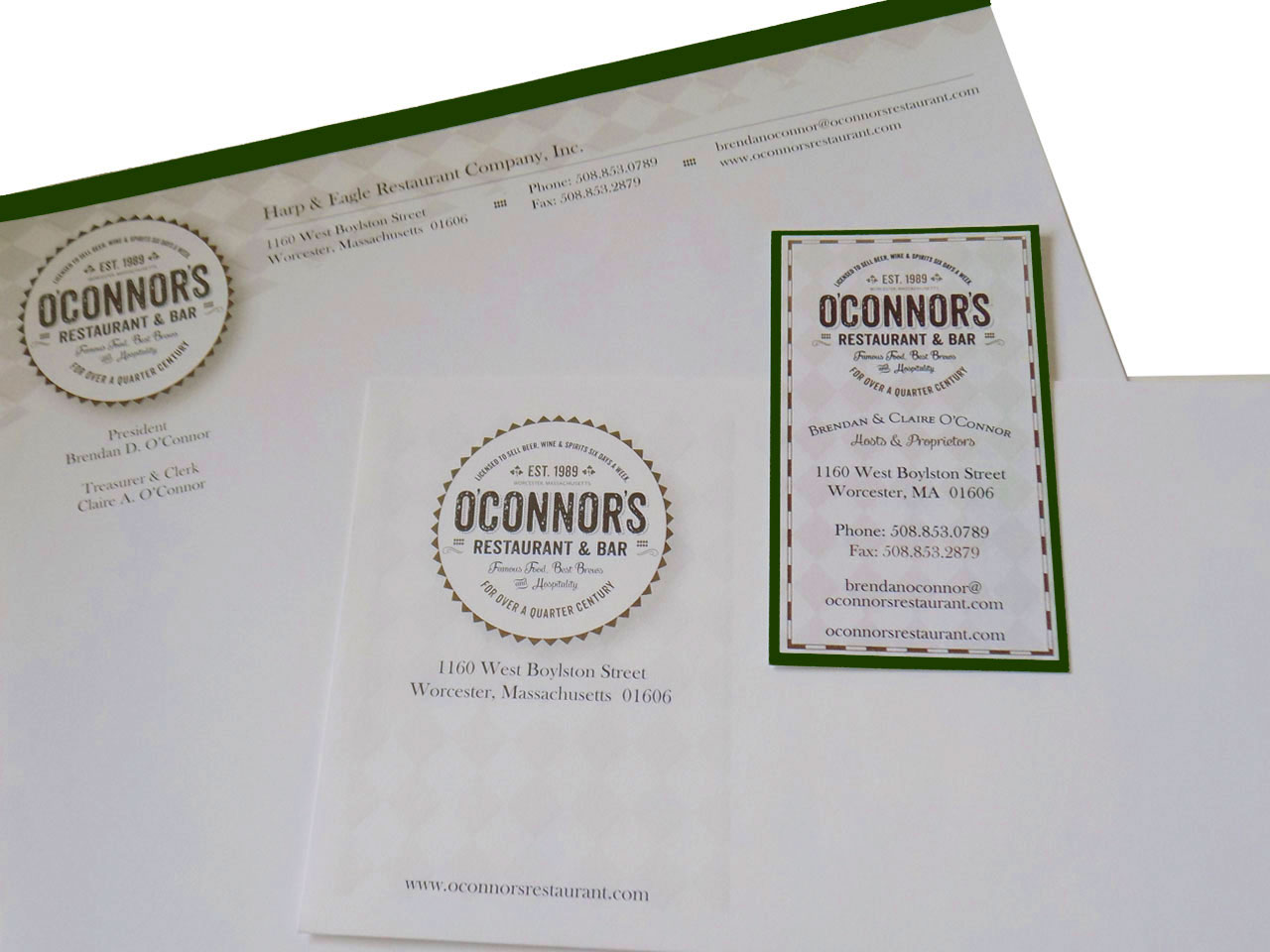
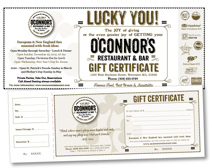
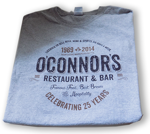
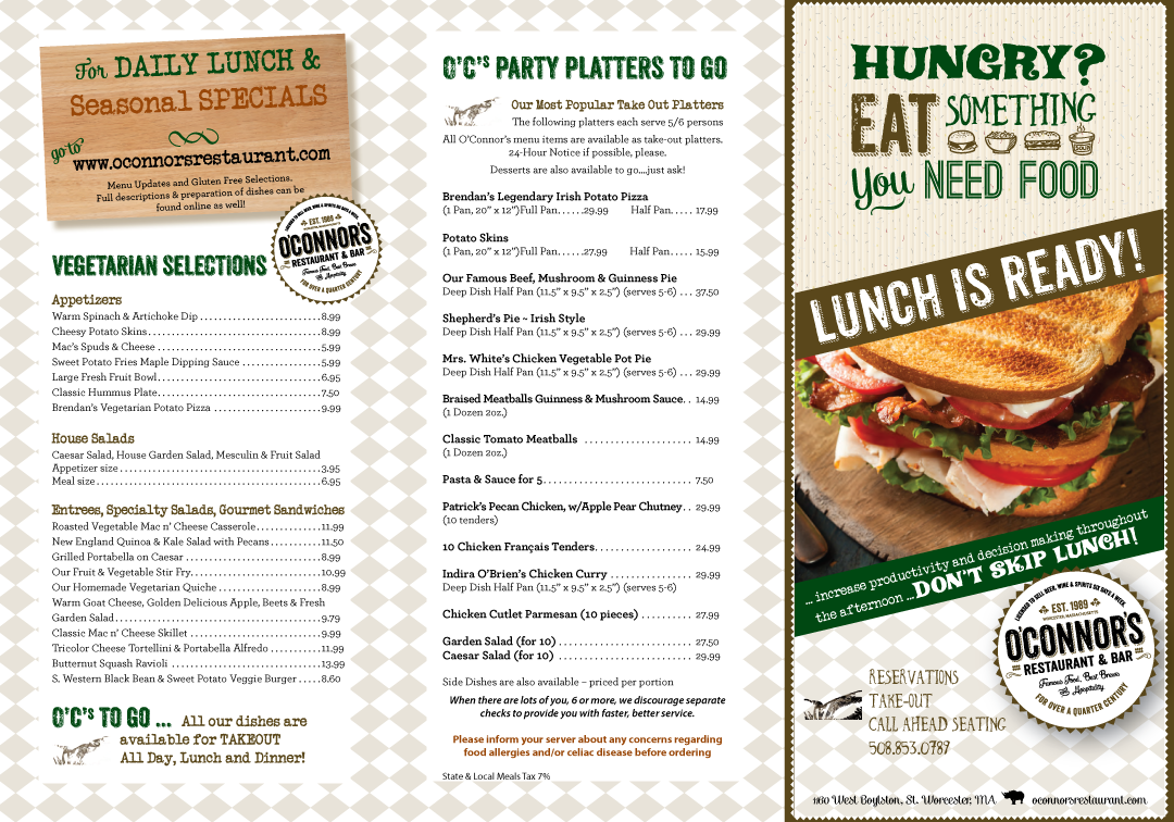
Design a logo for a local landmark. O’Connor’s Restaurant & Bar
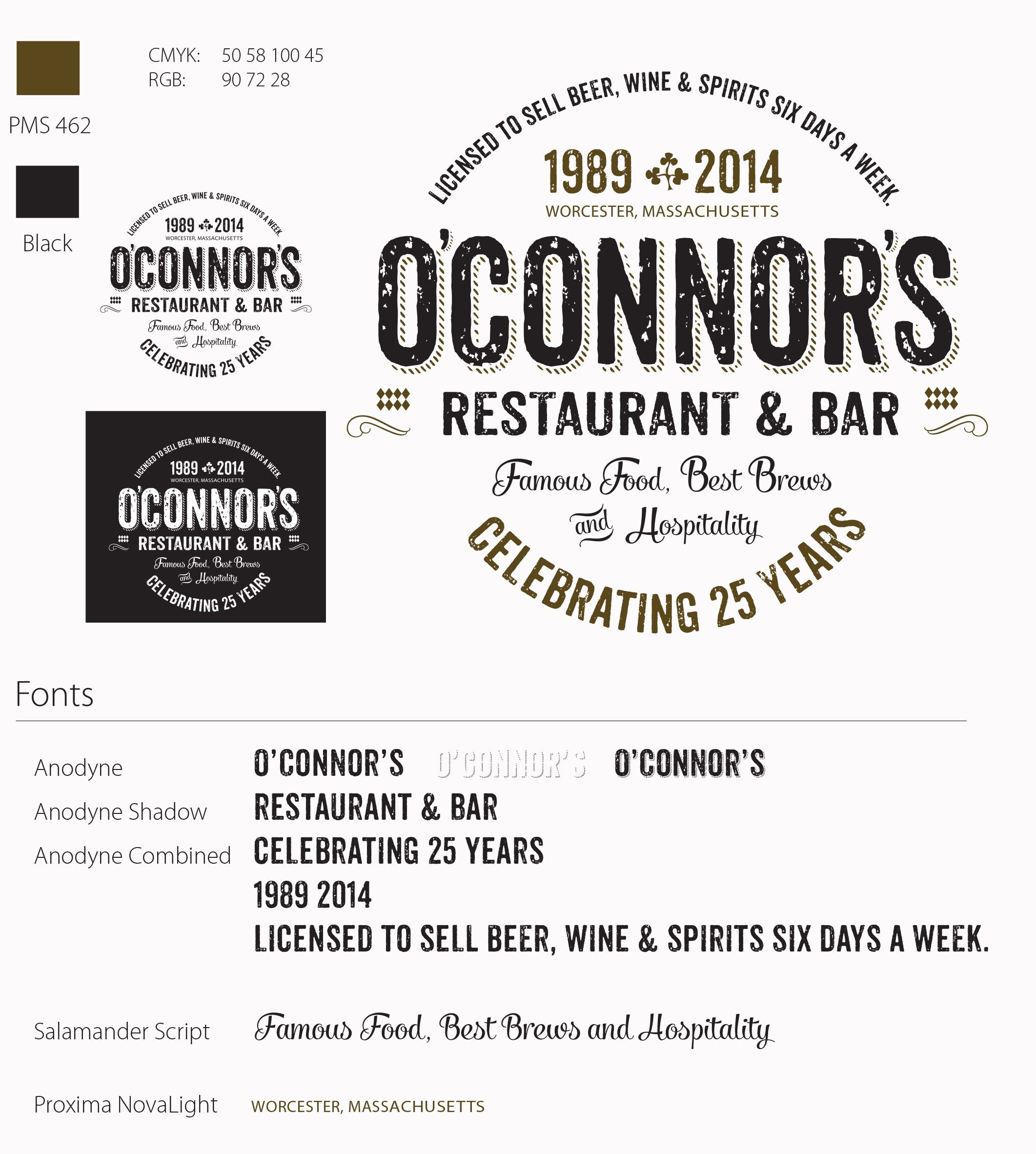
A logo designed for an extremely popular local restaurant had to be versatile. O’Connor’s logo would be on signs, menus, t-shirts, mugs, glassware, etched on doorways, placed on bumpers and gift certificates. The logo was designed in two simple colors, black and brown. Black for clarity and inexpensive one color printing and brown was added to give the logo an old-style feel. This was a fun client because I liked the restaurant as much as the regulars.
